In this chapter we define the signage systems. To ensure consistency across all different shapes and sizes, use the examples as guidance when creating the design and follow the graphic identity guidelines in place.
In order to guarantee a uniform and branded appearance, planning of signage must be registered with Group Communications - Trade Shows, Exhibitions and Events team, located in Germany, Hanau.
On-site signage
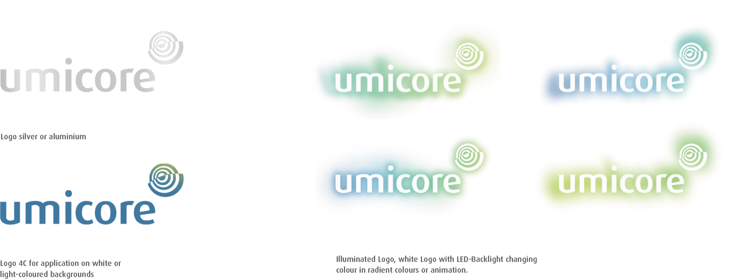
For certain sites, such as head offices, silver type finishes are recommended. Coloured finishes such as copper or gold clash with the color of the marque and should not be used.
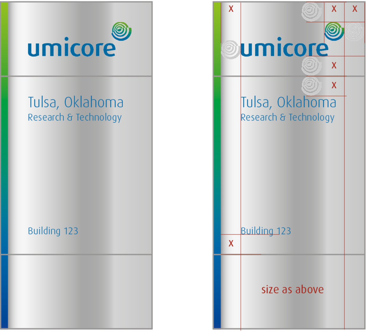
To ensure information is easy to read, the base color of all signs should be Umicore metal, with information in Umicore blue.

Specifications
- Marque should always be at the top of the sign, centered as shown in the measurement. X is the size of the Umicore Symbol. Horizon line separates marque from information
- Information is printed in Umicore Blue for optimal legibility. All text should be set in the corporate font: Dax Regular. The type size (capital letter) should be 0.5 x the „x“ height
- Always ensure size of information is appropriate for particular sign type. See the examples for different requirements. The arrow is easily set as the „<“ and „>“ of the typeface Dax. The size of the arrow is the same as the lower cases
Flags
Please find here some examples:


Specifications
- Height will change with different flag proportions
- Always ensure the Umicore marque is visually centered within every given shape
Building signage
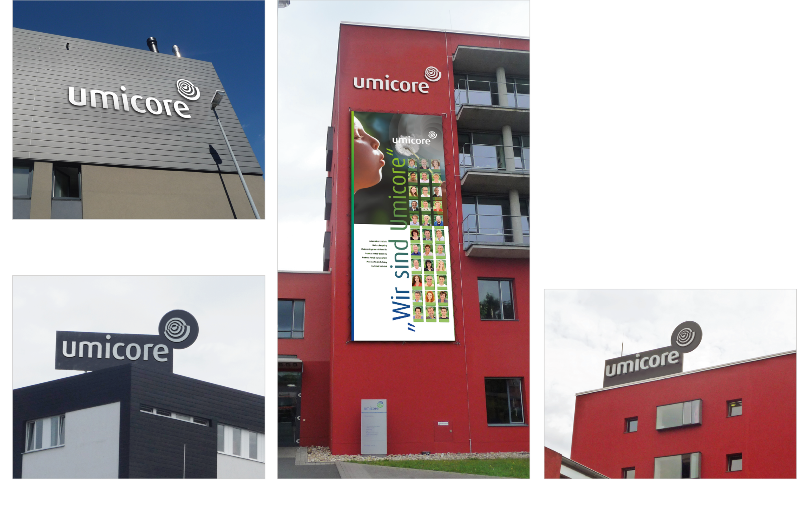
For a good long-distance effect the logo will be attached to the building – in white, black or colored – according to the architectural circumstances. Please ask the responsible facility manager what is possible, regarding local laws, industrial site rules, architectonic specifications and structural conditions concerning size, wind-protection, color, surfaces and coatings.
Specifications
- Application on large surfaces: Minimum clear space area to the right is one width of the sign, and to the bottom is threefold x-height
- At small areas: the logo requires a minimum rim of 2/3 x-height
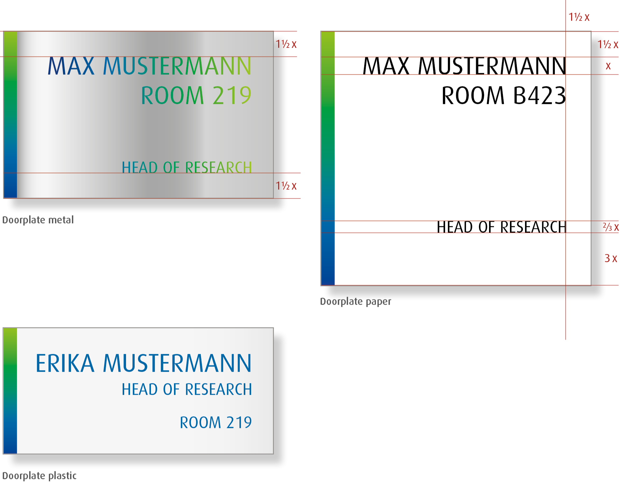
Doorplates
The doorplates should fit in the existing orientation system of the building. Therefore it is very flexible in the design. The use of the gradiant is obligatory.
The typo could be made in gradiant-colour, black, or Umicore-blue. The material can be metal, plastic or paper.
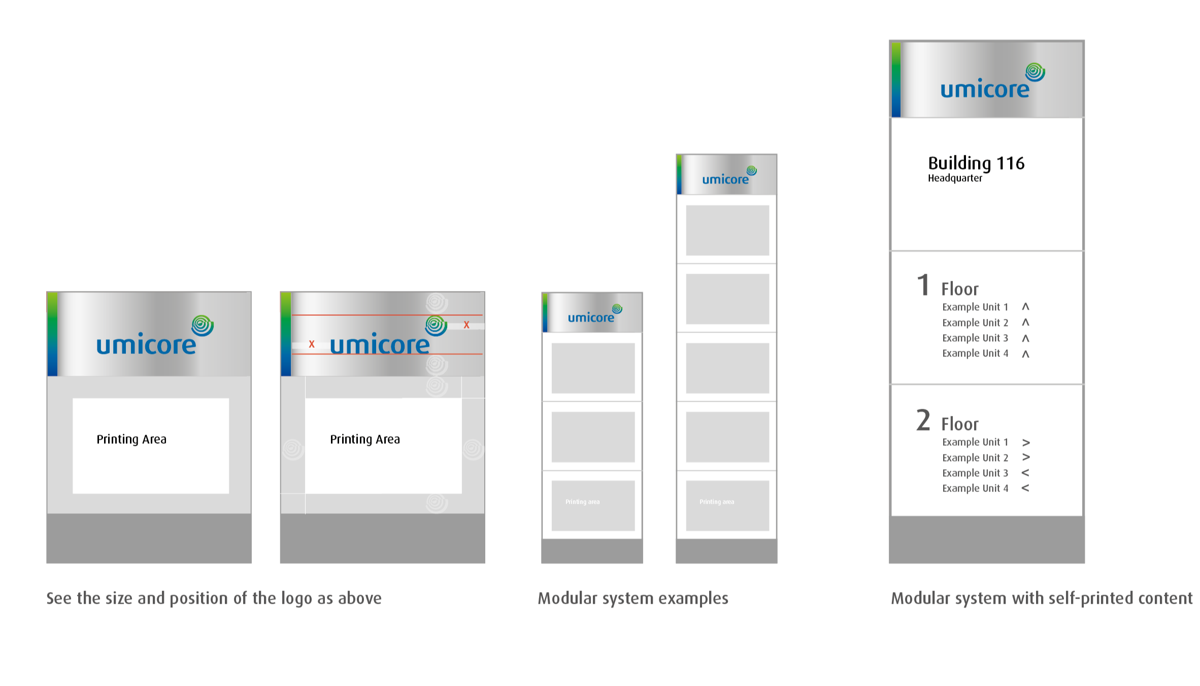
Orientation system
Frequent used is an orientation system with changeable modules. Metal surfaces with permanent inscriptions (on top and below) are complemented with change modules for paper inlays. The user can print this informations and change when required.
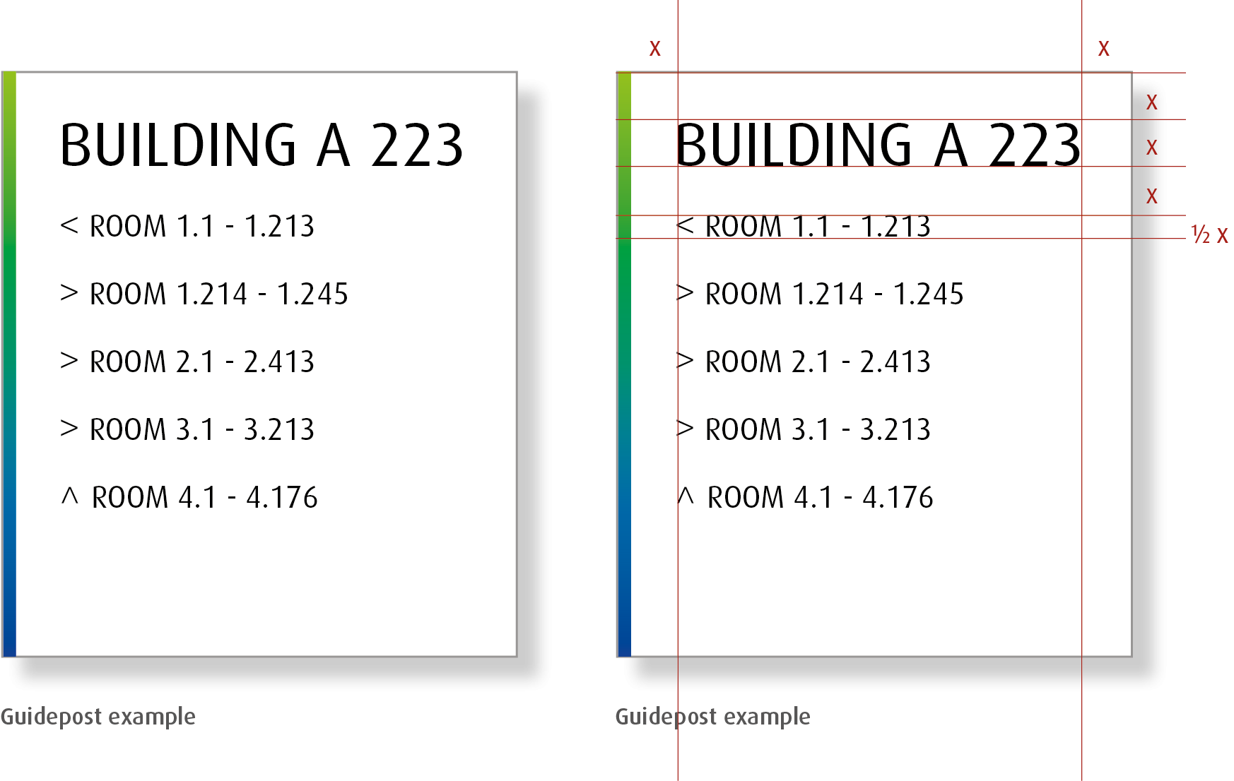
Guideposts
Guideposts should be easy to understand and simple to produce. Use the gradient. For the typeface use black, gradient-color or Umicore-blue.

